LUME Windows + Doors
Naming, brand identity and rollout
The Challenge
LUME came to Brooks & Boyd at an important point in the business’s growth. After moving to the Value Windows name, the team had gained a clear sense of how it was being received, particularly by trade partners. They saw an opportunity to build a brand that better reflected the quality of their work, their capability and where the business was heading. They also needed to strengthen recognition across the market and online.
They needed three things: a name they could confidently build around, a strong visual identity, and a clear plan for bringing every customer-facing touchpoint into line.
Our Approach
We started with a detailed discovery process. We looked at the business, its audiences, its ambitions, the competitive landscape and the impression it needed to make with homeowners and trade partners. From there, we developed a series of naming territories and options and tested each one against the strategy, the wider market and its potential to become a strong, memorable brand.
Creating the Identity
LUME was the clear frontrunner. It’s short, modern and easy to remember, and it suggests light without being a literal reference to windows. It also moved the business away from the price-led feel of Value Windows towards a more contemporary, design-led position.
Creating the identity
Jayde Drumm led the visual identity as Lead Designer, working closely with Olivia Brooks, who led the strategy, client relationship and wider project.
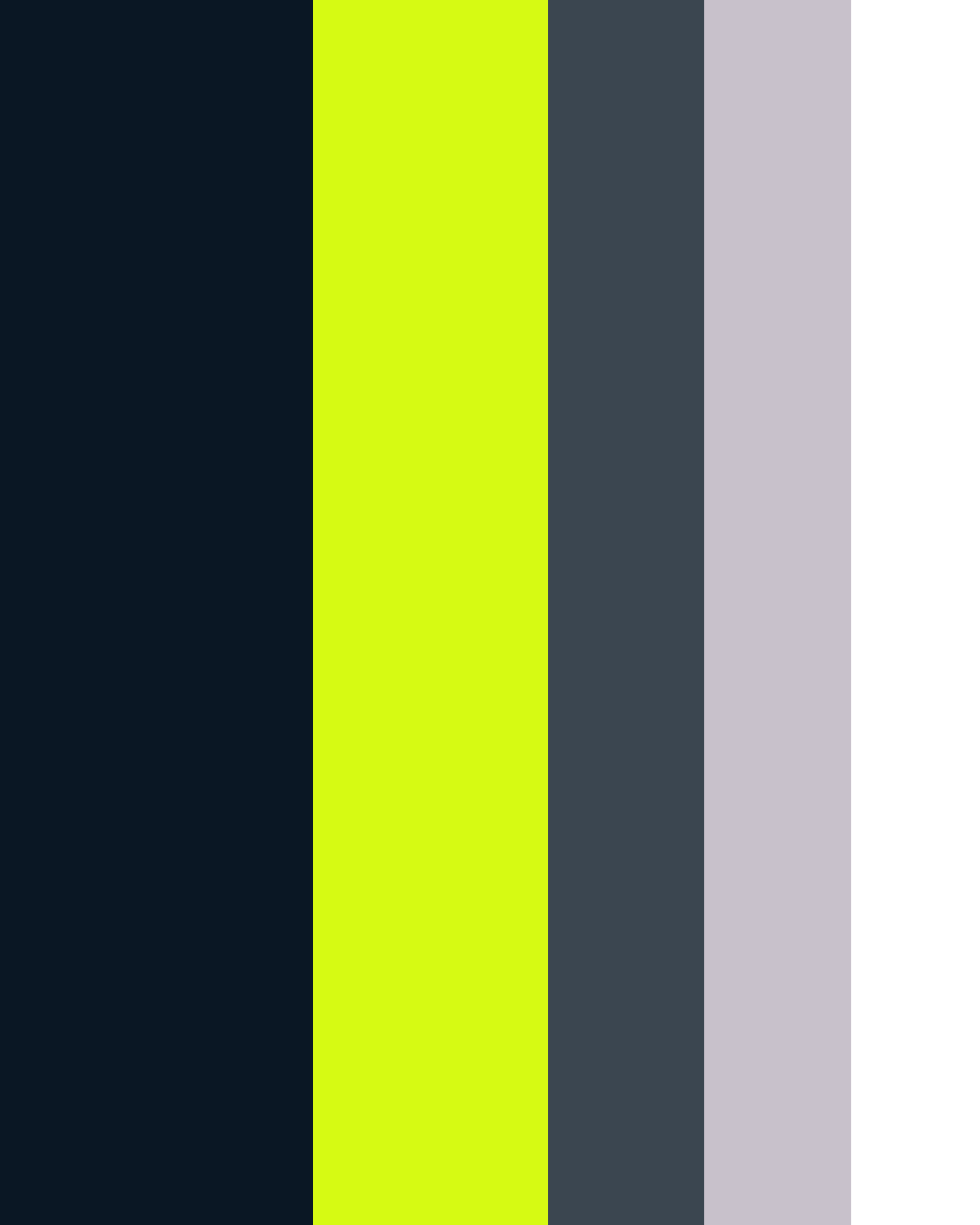
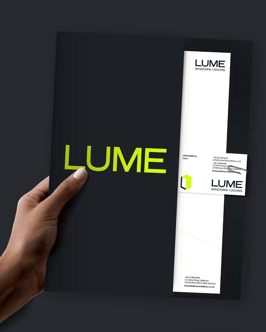
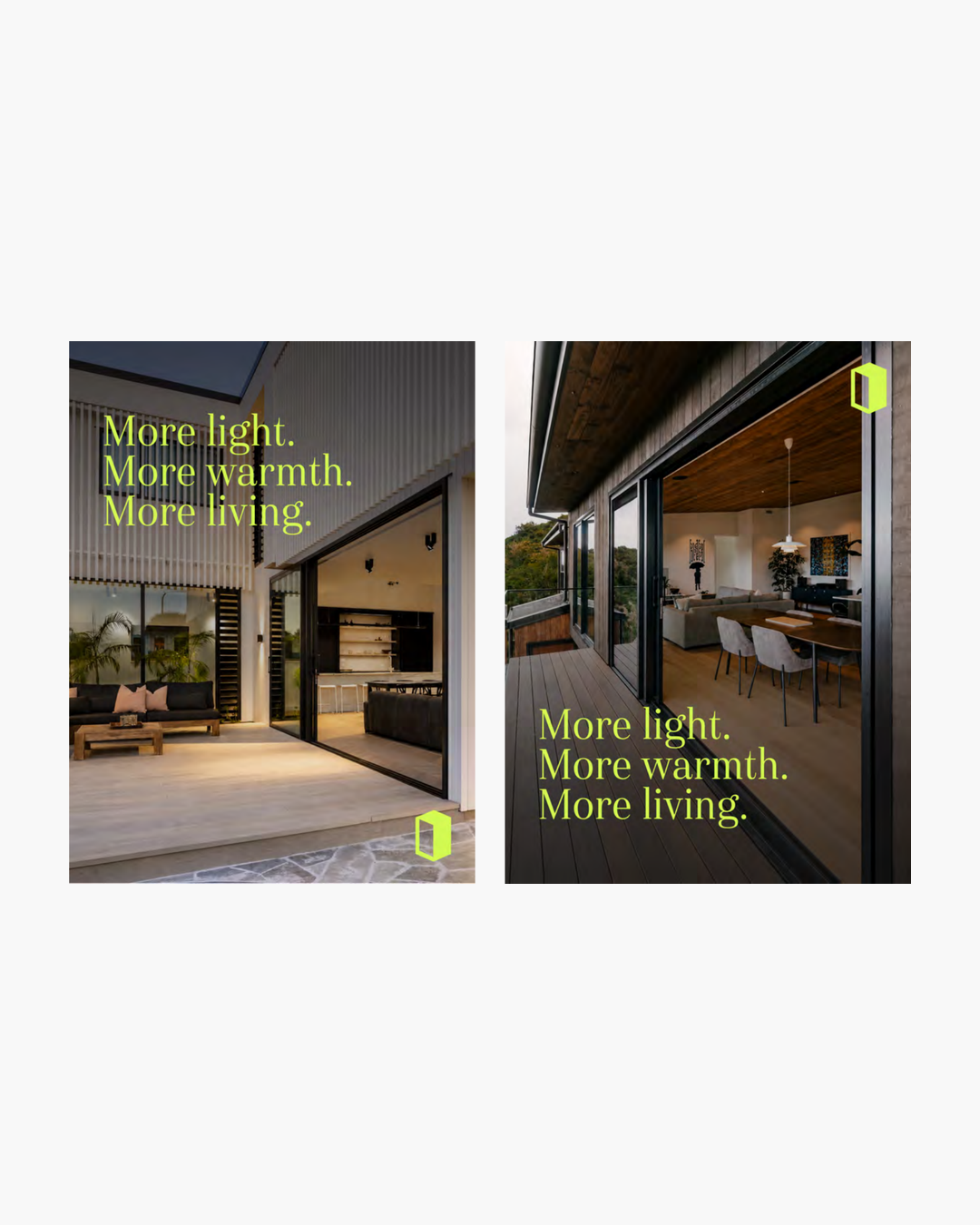
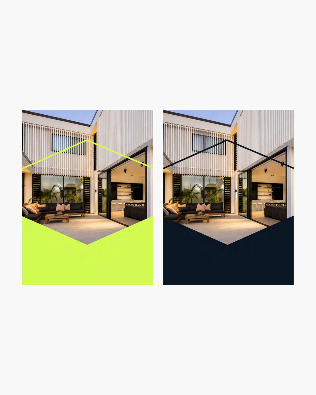
The brief called for something simple, bold and modern. The LUME mark is built around an elongated cube, giving a subtle sense of structure and framing without falling back on an obvious window icon. Fluorescent lime became the brand’s signature. It’s distinctive, but flexible enough to work across signage, vehicles, print and digital.
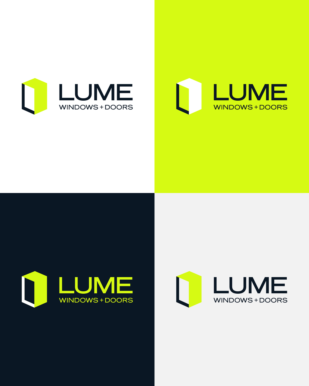
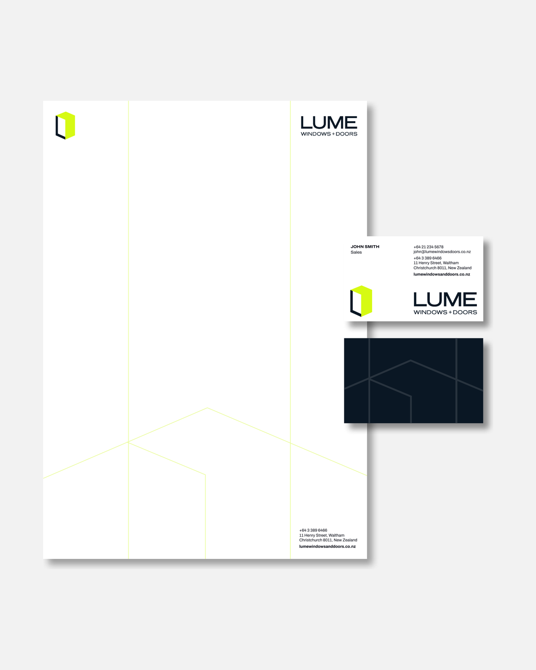
The full system included the logo suite, colour palette, typography, supporting linework and patterns, brand guidelines, and print and digital-ready assets.
Rolling out the brand
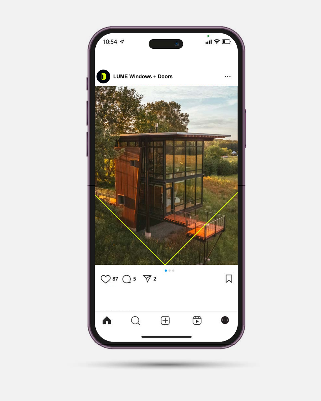
The work went well beyond the core identity. We built social media templates and assets for LUME’s internal team, along with teaser, launch-day and post-launch content ideas and practical checklists for updating their digital channels.
We also created and coordinated a wider range of branded applications, including:
Business cards and artwork for individual team members
Email signatures and technical specifications
Letterhead design and an editable Word template
Presentation folders
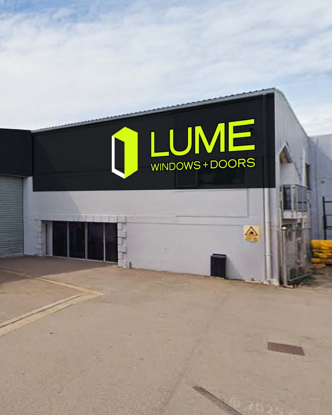
Building signage concepts
Vehicle branding concepts
Uniform concepts
The Outcome
LUME now has a brand that matches the business behind it. It’s cohesive, memorable and easy to apply, and it gives the team a stronger platform for building recognition with both homeowners and trade.
More than a change of name, the project brought real clarity to how the business presents itself and what it wants to be known for. The team now has a brand they can stand behind with confidence.